Music Branding & Album Art for Artists
Every music project has its own rhythm—some need bold, expressive album covers, others call for subtle, minimal visuals that let the sound speak first. I offer custom album art, promotional graphics, band branding, and design direction for independent artists and creative teams. Whether you’re releasing a single, an EP, or a full album, my process is collaborative, intuitive, and tuned to the energy of your work.
Jeffrey Dean Foster and the Arrows
Jeffrey Dean Foster and the Arrows commissioned social media poster flyers to promote an upcoming show, giving me full creative freedom to shape the visual direction. Inspired by vintage rock posters and the band’s gritty Americana-meets-singer-songwriter style, I crafted a bold, mixed-media design. Working from a provided photo of JDF, I created a stylized torso cutout as the central focal point. To reflect his distinctive, songbird-like vocals, I incorporated an illustrative bird, while dynamic red arrows visually reinforced the band’s name and added a sense of movement. The final composition blends retro aesthetics with contemporary edge—capturing the soulful spirit of their music.
That 1 Guy
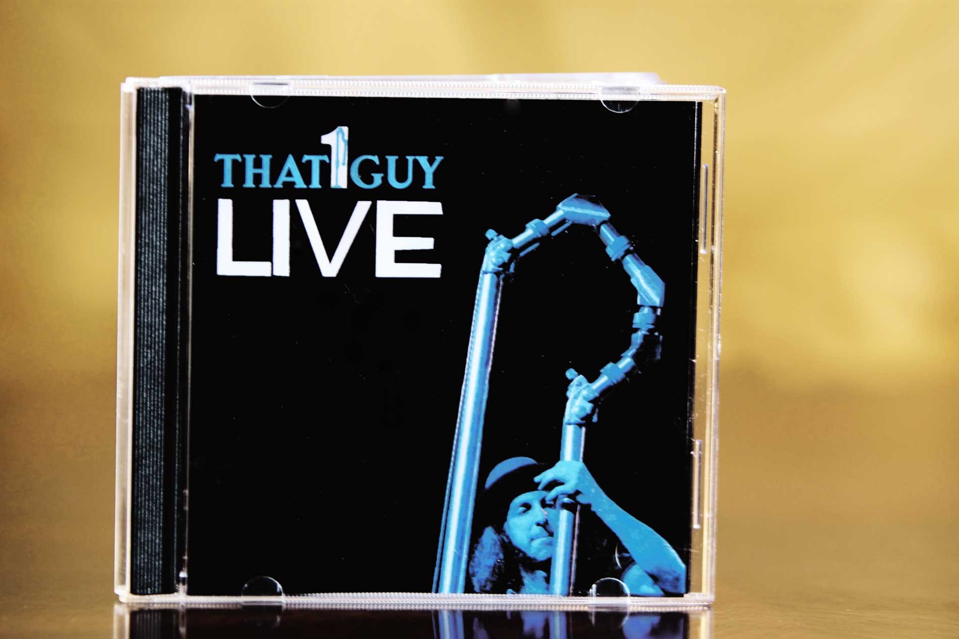
That 1 Guy, also known as Mike Silverman, stands as a uniquely talented musician renowned for inventing his own instrument, "The Magic Pipe." As a one-man show, he captivates audiences with his exceptional skills, incorporating loops and other quirky items like the Magic Saw, Magic Boot, and Magic Duck into his performances. With a musical style that keeps it funky and a lighthearted sense of humor in his songwriting, That 1 Guy wanted a logo that would reflect the essence of his artistry. Drawing inspiration from his iconic Magic Pipe, I devised a logo concept that integrated it into the "1" in his name. The distinctive and intriguing shape of the Magic Pipe lent itself perfectly to this incorporation, forming a visual representation of That 1 Guy's extraordinary musical identity.
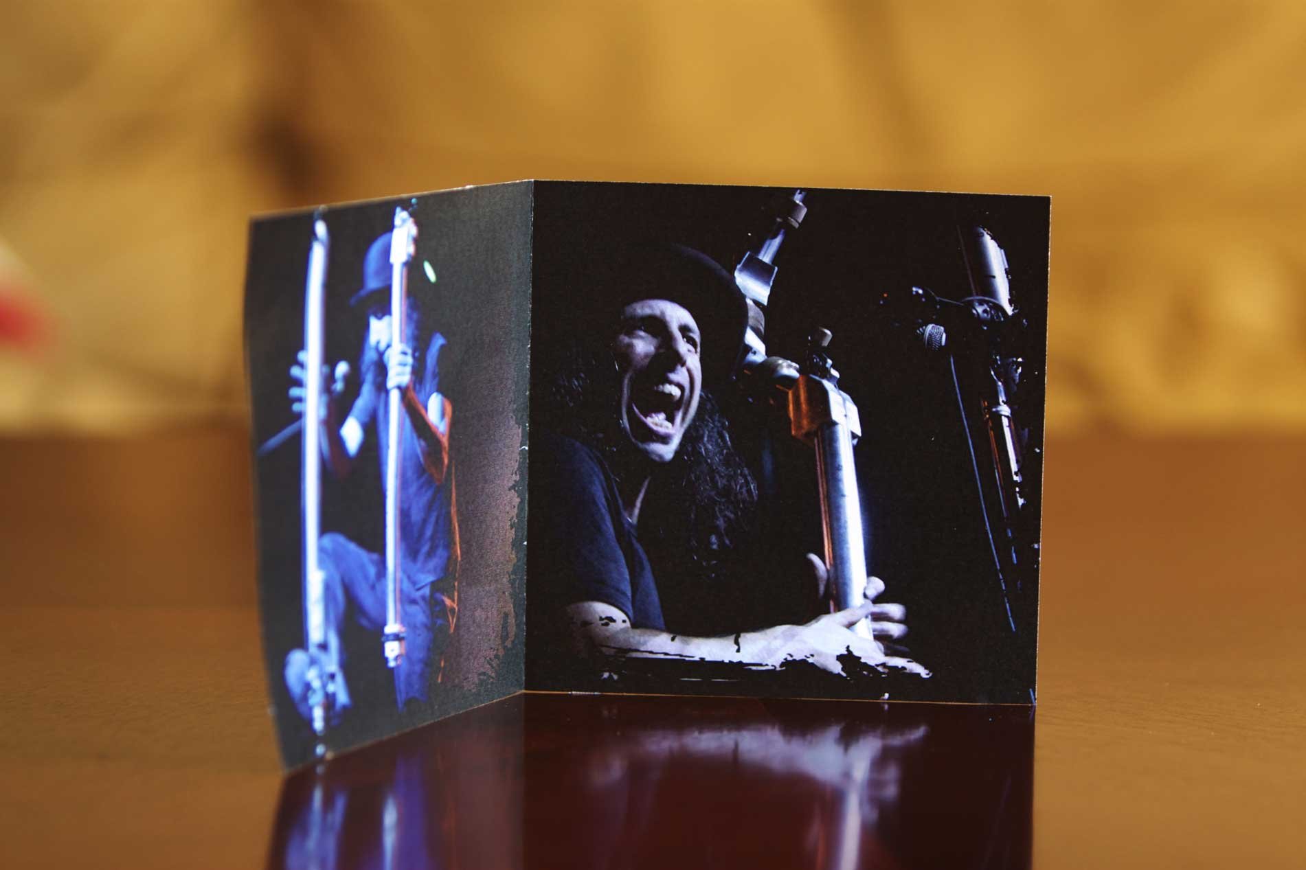
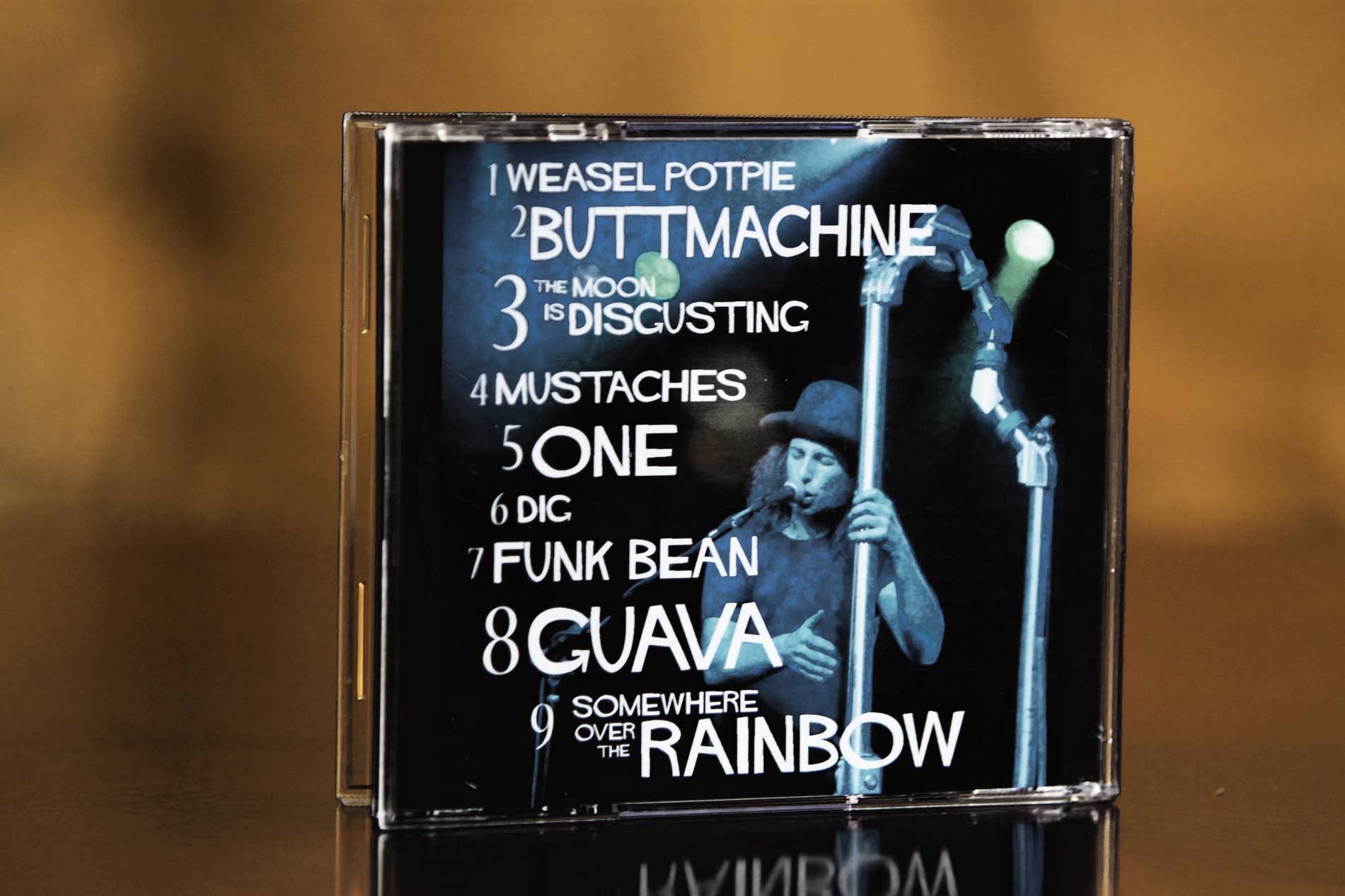
For the font selection in his CD packaging, I opted for a bold and exciting style that echoed the energy of That 1 Guy's music. The font choice enhanced the overall appeal of the logo, infusing it with a dynamic and captivating aesthetic. Inside the packaging, I took original photos and made sure to capture the essence of That 1 Guy's live performances, showcasing the fun and joy he brings to the stage. By incorporating these elements, the logo not only became a powerful symbol of That 1 Guy's unique musical persona but also invited audiences to experience the thrill and excitement of his performances, creating a deeper connection between the artist and his fans.
Jesse Malin
With a photograph captured through my lens, I crafted a powerful Jesse Malin icon that encapsulated the essence of his being. The raw emotion and punk rock attitude emanating from the image breathed life into the artwork, mirroring the true essence of this enigmatic musician. Through my creative process, I aimed to immortalize the spirit of Jesse Malin, crafting a visual representation that resonated with the raw energy and passion that defines his music and persona. The icon became a testament to the transformative power of art, capturing a moment in time that allowed viewers to glimpse into the soul of the artist, forever preserving his essence and impact in the world of punk rock, americana, and beyond.
Strung
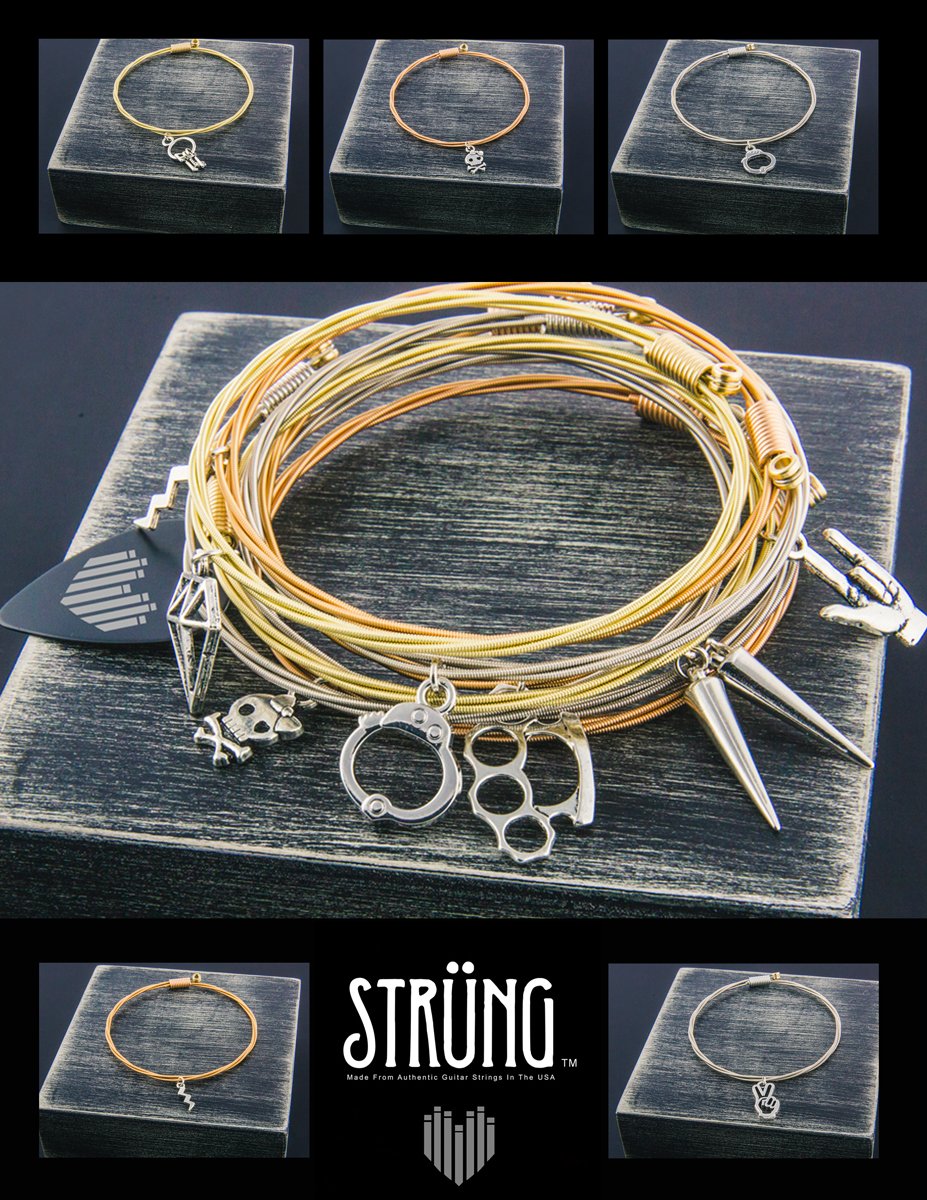
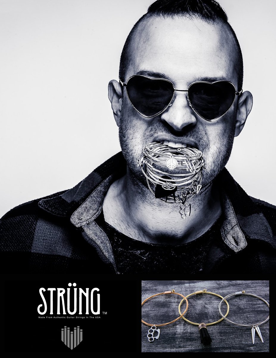
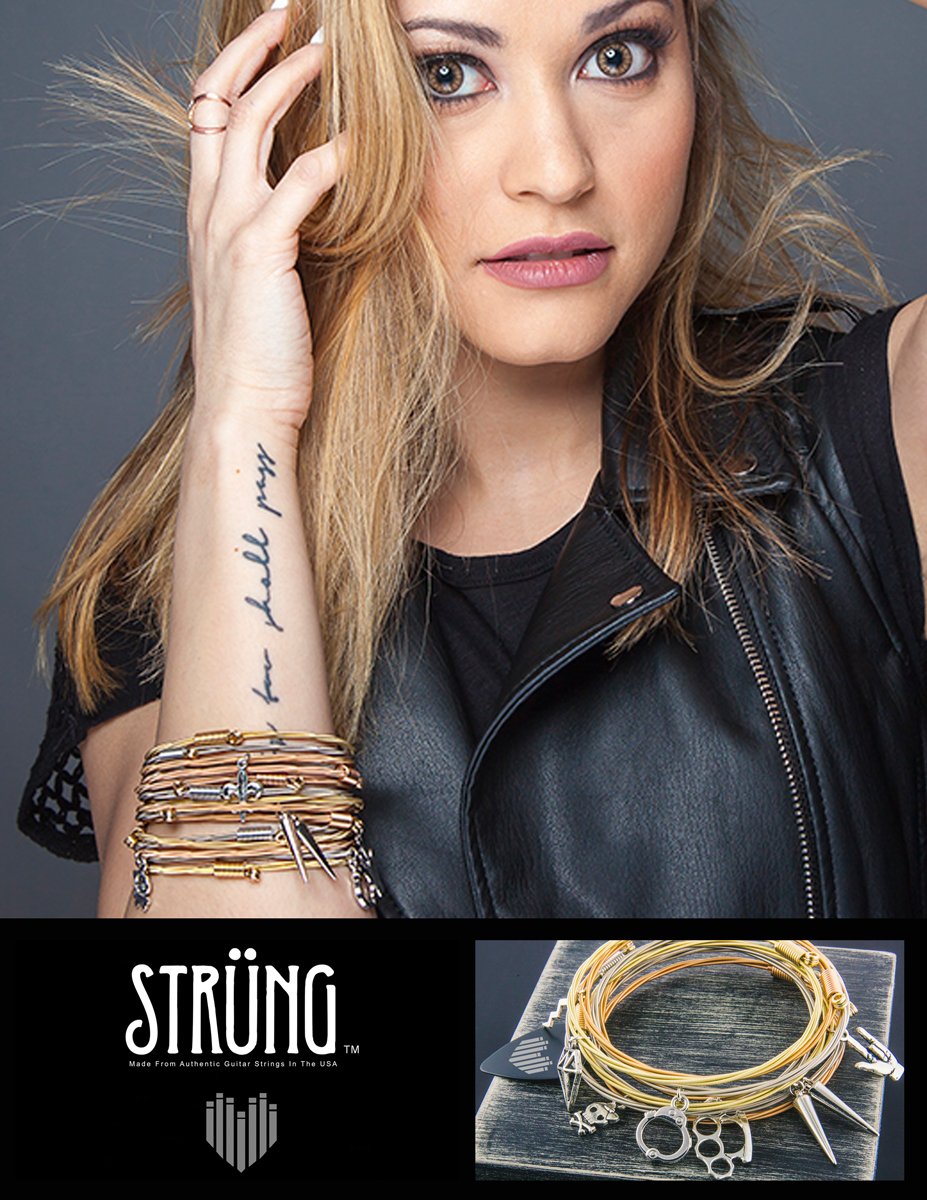
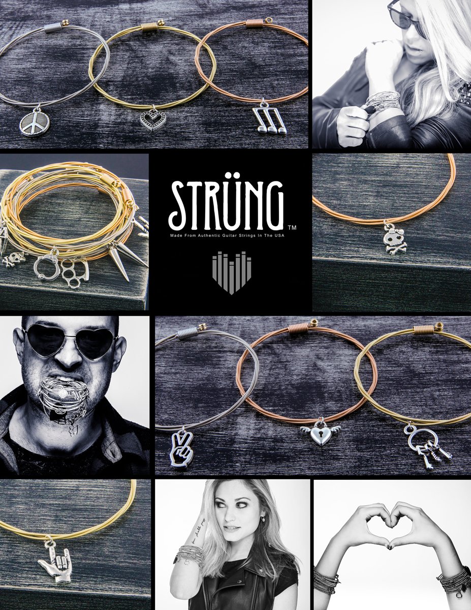
Strung, exquisite handmade bracelets made from guitar strings, demanded a creative approach that celebrated the fun, quirky, and rock'n roll essence while exuding the sophistication of high-quality craftsmanship. In response, I designed a set of four ads, each narrating a distinct story, artfully weaving together all the desired elements to resonate with their target demographic. Each ad became a visual celebration of the bracelets' unique charm and musical inspiration, capturing the attention of music enthusiasts and fashion-forward individuals alike. The cohesive narrative across the set of ads ensured that Strung left a lasting impression on their target demographic, evoking a sense of excitement and fascination with the intertwining worlds of music and style.
The Veldt
The Veldt, an innovative shoegaze band, challenges conventions with their unique musical style. Comprising twin brothers, their artistic expression stands as a testament to their bond and creative synergy. In designing the flyer, I aimed to showcase their alternative side, capturing the essence of their nonconformist approach to music. The flyer became a visual manifesto, encapsulating the sonic allure of The Veldt's performances, inviting music enthusiasts to immerse themselves in a world of unbridled creativity and musical exploration, while begging to let their mind wander.
Wikkid Starr
Wikkid Starr's album cover was envisioned as an embodiment of California's essence, exuding the allure of sexy women and the fierce spirit of hard rock. To capture this vision, the front cover showcased a seductive and scantily clad model, radiating confidence and allure. The album's design aimed to evoke the spirit of California's magnetic charm, blending it seamlessly with the powerful energy of hard rock, creating an enticing visual experience that mirrored the band's edgy and rock driven sound.
Cope Fiend
Cope Fiend, the indie band hailing from Charlotte, NC, has been gaining considerable recognition in the music world. When tasked with creating their logo, I received sketches from the band detailing their vision. I refined and polished these sketches to create a seamless and never-ending circular design, with a striking red interior. The logo embodies the band's perpetual passion for music and their relentless dedication to their craft. With a female singer and a male drummer, Cope Fiend's logo becomes a powerful representation of their unity and harmony, capturing the essence of their captivating sound and magnetic performances.


